Laura Keller Real Estate Team
Laura Keller, came to Brixwork requesting a new brand identity for her real estate team in Carleton Place, Ontario. The client desired a logo design that would be immediately recognizable, memorable and hold meaning to the real estate market.
Problem: In real estate marketing, we frequently receive numerous requests from clients asking for their logo to resemble a house. As a designer, it is my responsibility to ensure that the client's brand does not fall into the generic 'another REALTOR logo' category. A logo should be distinctive and withstand the test of time. To achieve this, the design must be entirely authentic and unique.
Authentic identities emerge from a creative process that is both researched and intuitive.
Symbol Design
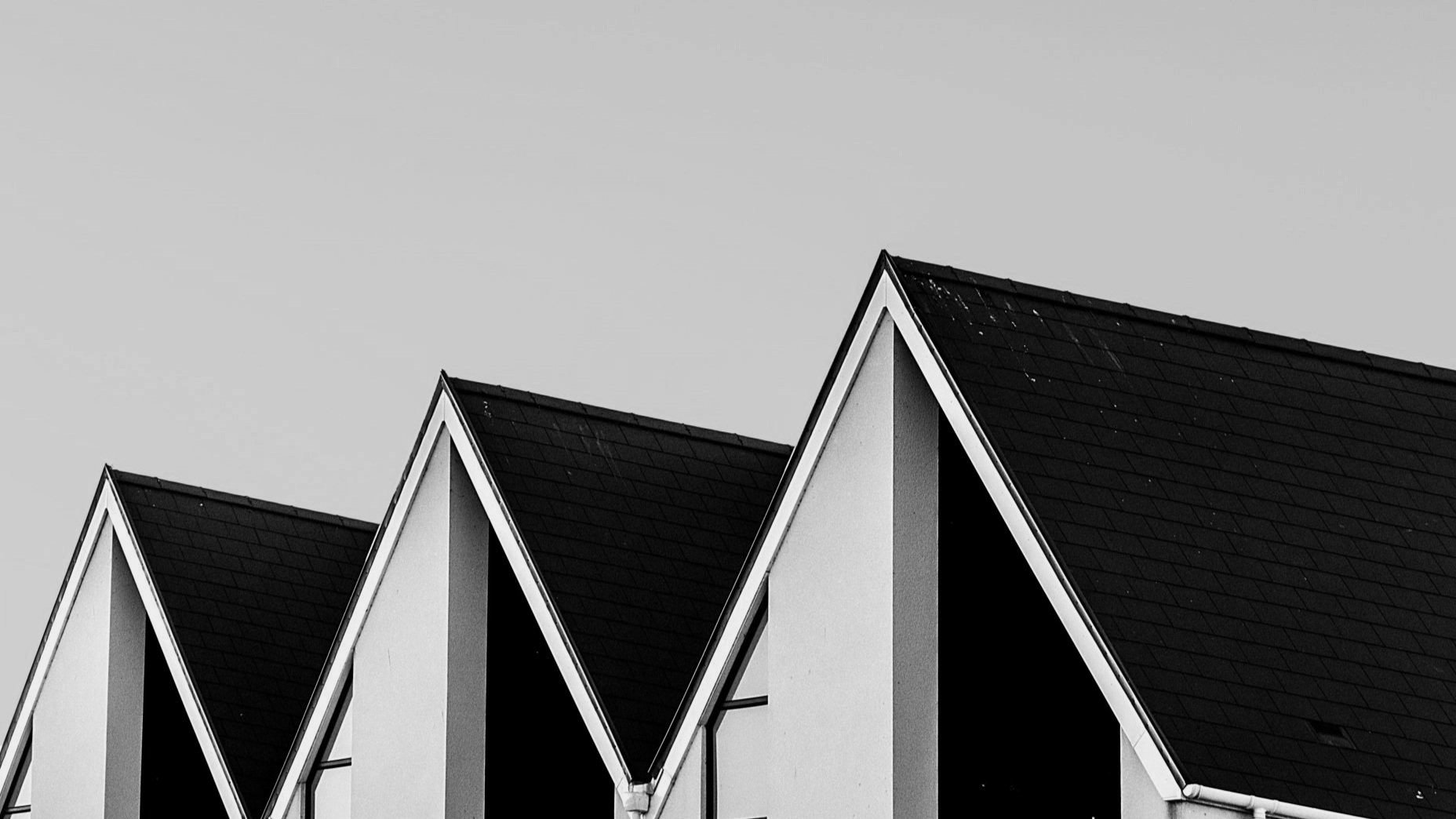
The creative process of establishing meaning in brand identity. The mark of any logo, is the DNA of the brand. Through concept sketches I was able to explore & achieve the form of the logo, what it symbolized, and what it stands for. Whilst keeping the target audience in mind, I wanted the logo to resemble an architectural form, reminiscent of a roof, which would evoke a sense of home, shelter and success.
Colour Brand Identity
Hand selecting a colour palette, was integral to expressing the branding identity. A colour palette that facilitates recognition and builds brand equity. For Laura Keller’s brand, I have selected the Vanity Fair red, which would add that feminine touch to a sophisticated logo design.
2019
Laura Bailey (Graphic Designer)
All rights reserved by Brixwork Real Estate Marketing Inc.
Custom Typeface Branding


